Many small and medium-sized businesses don’t have a graphic designer on staff, but all of them need business materials designed – menus, price lists, logos, business cards, letterhead, social media graphics, banners, ads. Pretty much all of your business collateral has design elements to it. If you don’t have a designer on staff, those elements have to come from somewhere. Do you think it needs to be you doing the design work?
If you’ve gone the extra step and bought Creative Suite to try to give your poster or social media graphic a professional feeling but you’re probably feeling awfully overwhelmed right now. Sure you can watch YouTube videos for hours that will teach you how to use basic Illustrator tools, but that still doesn’t teach you how to design. Thankfully, we have a team of graphic designers that are here to give you tips to help ease you into the design world.
Colour Matters
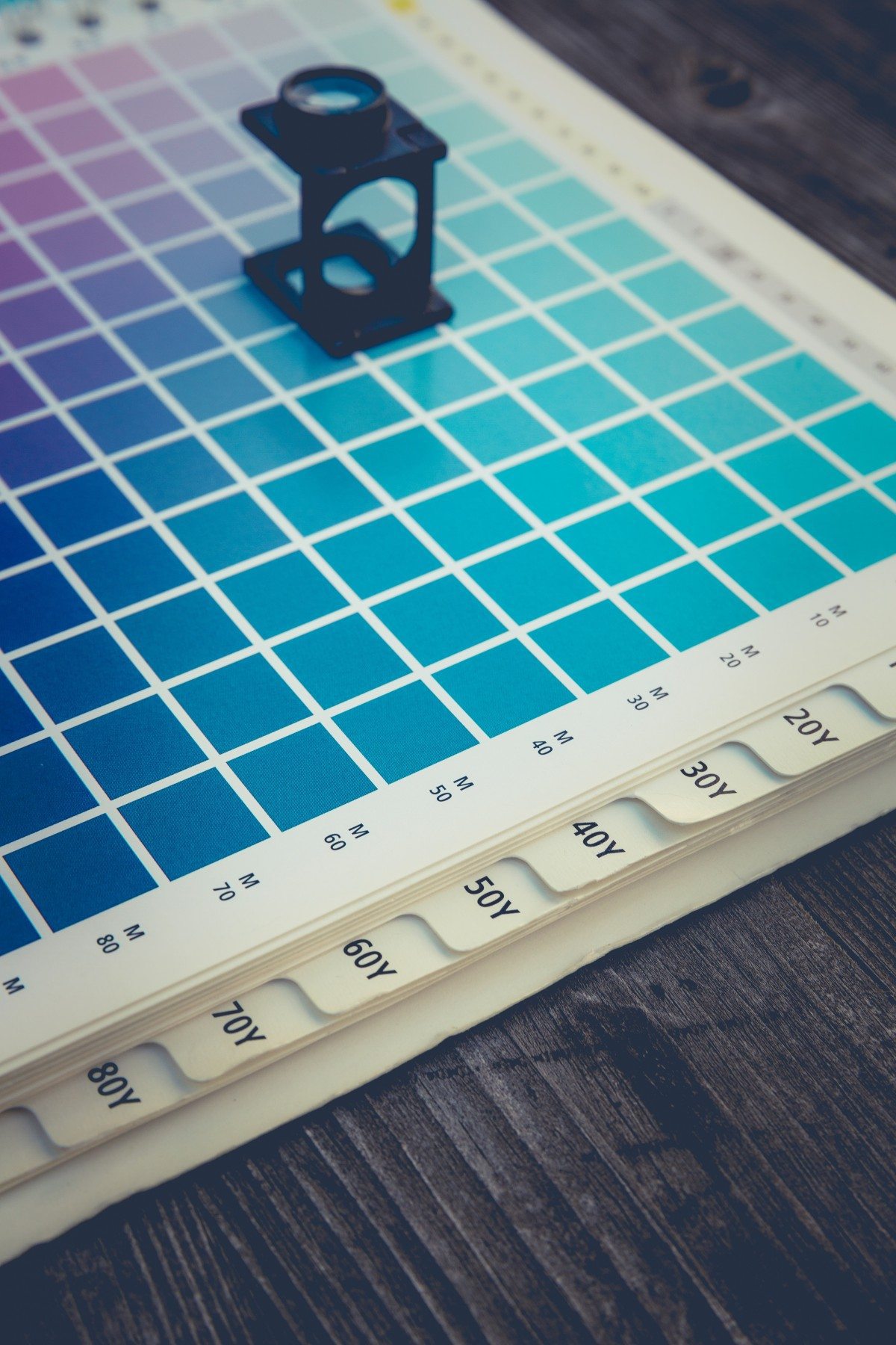
Great design tends to start with the colours. Having a pre-determined brand colour palette will help you out immensely going forward. Not only will a specific colour palette help differentiate and identify your brand to the public, but it makes designing a lot easier if you don’t have to choose colours all the time.
Get Fonty
Fonts are fun! But for an untrained or new graphic designer, playing with multiple fonts is generally not a wise idea. Unless you’ve had some typography training try to stick with 1 or 2 fonts and even using two can get messy. If you’re going for the two font look the general rule is, use one font for the header (headline) and one font for the body text.
Alignment
Having proper alignment is your not-so-secret weapon. People may not be able to physically see if a flyer or poster has wonky alignment, but their brain can tell – it can completely turn them away from your message. On the flip side, having proper alignment can give your design a professional and polished appearance.
Body Copy
When it comes to the body text of most marketing materials, the golden rule amongst designers tends to be: no more than 35 characters per line. Any longer than that and the design will begin to look messy, cluttered and unreadable. Much shorter than 35 characters doesn’t look any better, it looks scattered and people will have a hard time reading it.
Keep It Simple, Stupid
So this is our advice for pretty much everything, but that’s because people have a habit of overdoing pretty much everything – especially with design! When you’re done, if you still aren’t feeling great about what you’ve done, start removing extra elements. It’s quite probable that once you have removed an unnecessary item or two (or 12) you will like your design a lot better.
Of course, these are just a sampling of the myriads of items to keep in mind when you are creating designs for your business. If you put all these tips to good use and you still don’t like your designs, we are here! Remember our team of graphic designers. We can do all of your designs for you. From social media graphics to proposals, we design it all. Give us a call and see what we can do for you!
