2015 has been a year of interesting changes and progressions in graphic design and website design. Here are some trends that we have picked up on:
1) One of the biggest trends going around is to have an interesting image as a background for the website page. With the variety of stock photos and amazing photography available nowadays, there’s bound to be a perfect fit. These images convey the tone and give a first impression for the website. Usually this is paired with a typeface and unobtrusive graphics to match. The photo is really the main focus and attraction piece for setting the reader in a certain mood and mindset for the rest of the site.
2) Just like how a photo can convey messages, a video can too. Now we are seeing many front pages with beautiful videos of what a company does. The key is to let the video speak for itself. Usually artistic videos and playing in the background will add a special feature to the page and not distract from the buttons that lead to other informational pages. Typically we see this for more creative websites.
3) Flat graphics are making an impact too. With companies simplifying logos and having just colour blocks without extra lines, this style is finding its way into the website design too. This style is simple and clean with little distractions; it’s also a good way to portray things that maybe don’t look so good in photos.
4) A trend that is not so much design but more format of the site itself is the use of scrolling instead of clicking. It used to be that each page crammed as much information as possible with several tabs and links to filter though. Kind of like a website maze. But now with the ease of web space and fancy graphics and animations, content can be presented in a more indirect manner. This allows content to spread across one page with scrolling that acts as a guide for the content.
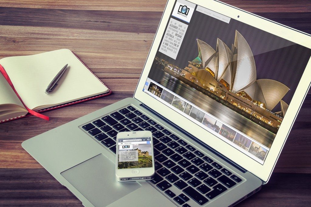
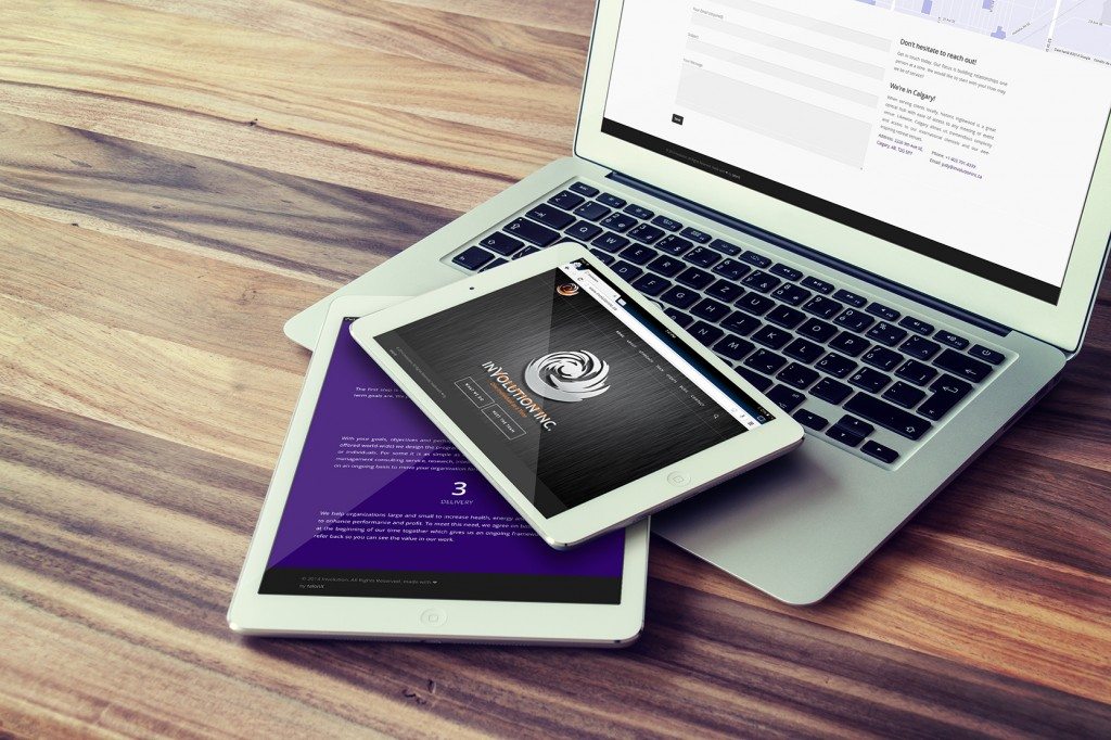
5) We cant express the importance of making websites mobile friendly. Google says that more than half of all searches are happening on mobile devices. With its convenience and usage rate, it is very important to make your site look good on these devices as well as on a desktop. For the cross platform transformation we see similar trends on mobile devices with the main image as the background and a tab in the corner for all the other pages. Its basically transforming the website into what an app would look like.
So there are the 5 things that have been fairly trendy this year in website design. It’s interesting to see the evolution of websites from one year to another.