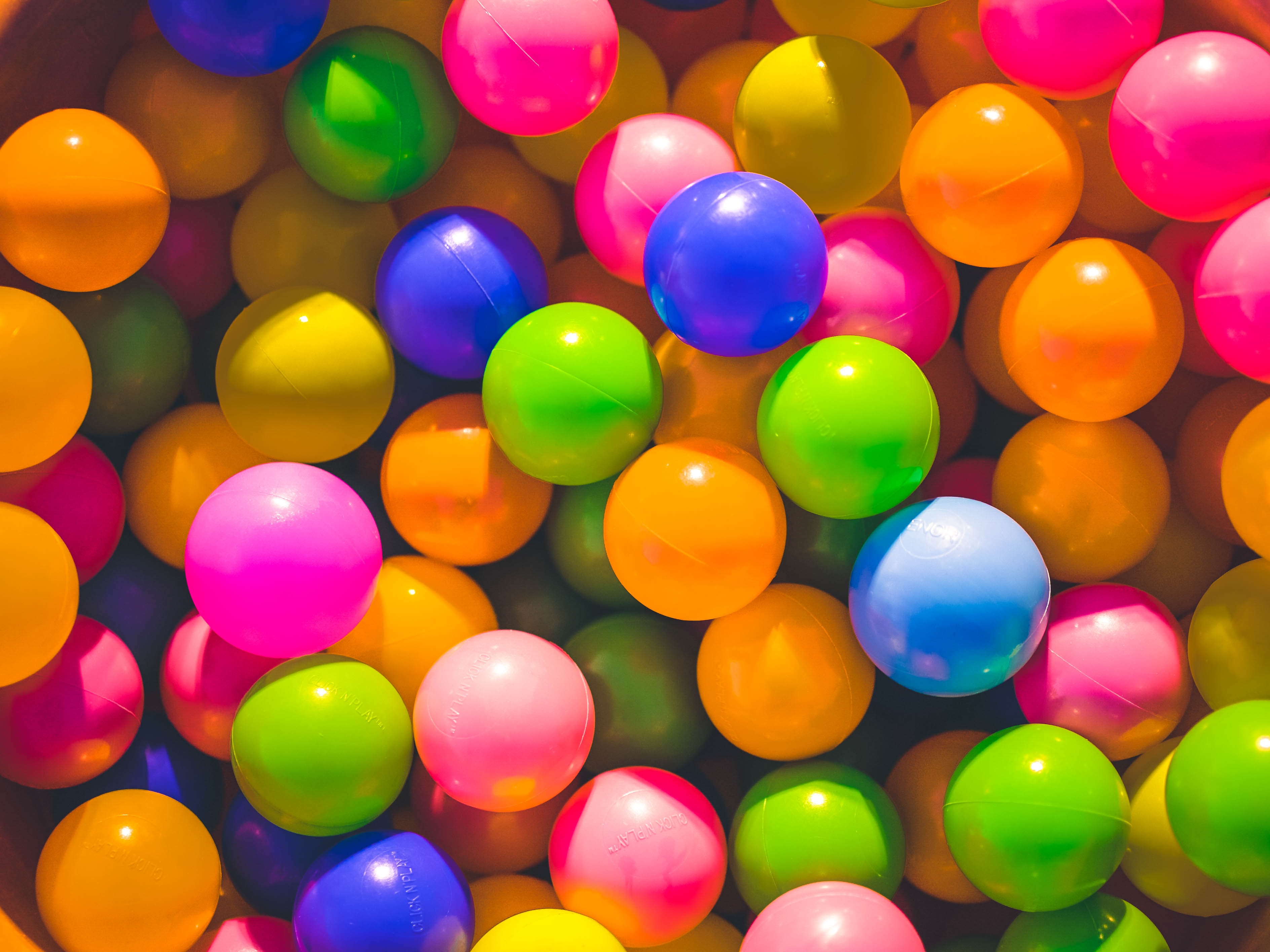
When it comes to branding, colour is key. Every business should have a complementary colour palette that is used exclusively for their brand. Specific hues can make a brand instantly recognizable. Coca-Cola’s red and McDonald’s arch yellow are trademarked and only they can use those particular shades.
Colour can convey that message quicker than words do as our brains are programmed to respond to it, green means go and red means stop. You don’t want your website to inadvertently tell your audience to stop when you want them to go. Thankfully we are here to help guide you down the path of deciding your colour scheme.
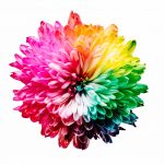
Colour Psychology
Every colour means something to people. Look at a cigarette pack, every menthol flavour has some sort of green packaging, mint gum is green, mint candies from diners have green swirls…well, you get the picture. Dark purple has regal undertones and bright red means stop. What do you want your scheme to convey about your business? If you want to get more into colour psychology, you can read our colours to use in web design blog post.
Colour Wheel
Get acquainted with the colour wheel. This will be your best friend throughout your search for the perfect pigments. The wheel is a circular representation of the relationship between primary, secondary, and tertiary colours. The more hardcore the wheel the more shades/tints it will show. Learn how the wheel works and how to use it to help you pick your brand palette. Pro-tip, colours directly opposite of each other on the wheel are usually complimentary. The square is also a common palette choice, choose four colours on the wheel that are evenly spaced and create a square.
Convey the Right Message
When a brand uses the wrong colour it really can turn people right off. You would never find a bank using hot pink or lavender in their branding, neither of those colours scream reliability or financial acumen. Choose a scheme that relates to your topic and conveys the right message.
Add a neutral or two
Most palettes include dominant, secondary and neutral colours. The neutrals will be the base of your scheme so they are best when they are shades of beiges, greys and creams. Neutral colours tend to give off that warm feeling and are enticing to people.
Palette tools
Choosing a colour palette can be exciting and frustrating and everything in between. You know that saying: there is an app for everything? There’s a million and one palette choosing apps out there when picking your pigment is making you want to tear your hair out find one and let it do the heavy lifting (finding the perfect hue) for you.
Colour is an instant way to express your business without the use of words, so express your business the way it deserves to be expressed… the right way! If you have picked your palette but need help designing a logo or you’ve had it picking your pigments and want help from the professionals, that’s what we are here for. Give us a call and come have a coffee and a chat.