Hello first blog post of 2016! We here at talonX design would like to wish you a very happy and successful new year! With 2015 behind us, we are excited and looking forward to see what 2016 has in store for us.
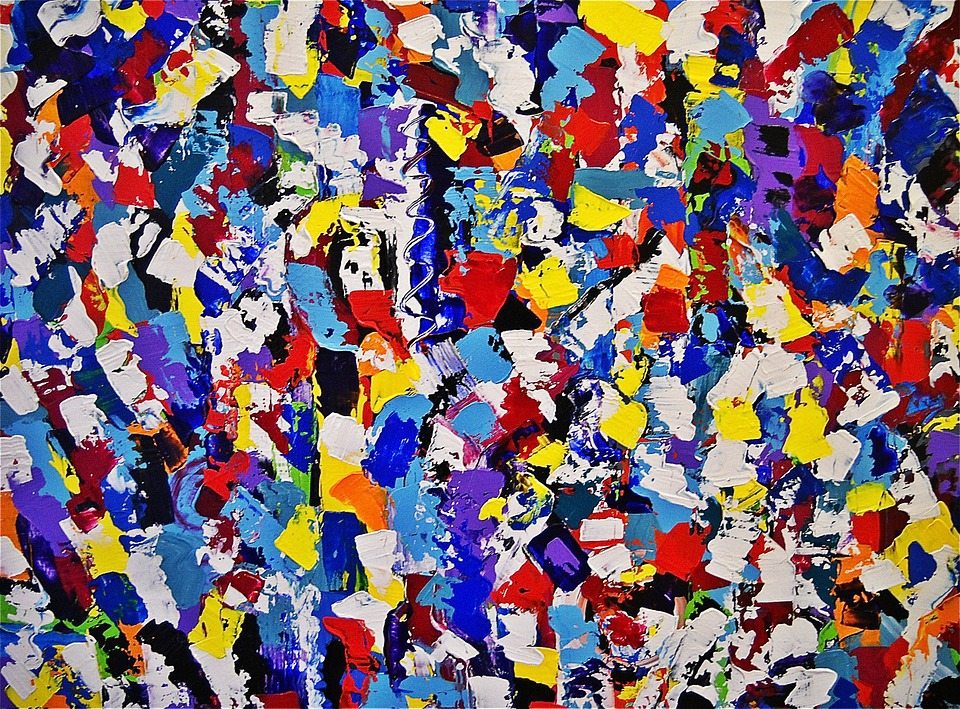
Today’s topic will be discussing the importance and effects of colour in design. So why is colour important in design and why should we carefully consider the shade tone and vibrancy of a colour before we choose one? We all know how easy it is to simply choose your favourite colour and move on with the design. But your favourite colour may not compliment the rest of the design. Here are some things to think about when you’re next face with the difficult colour decision.
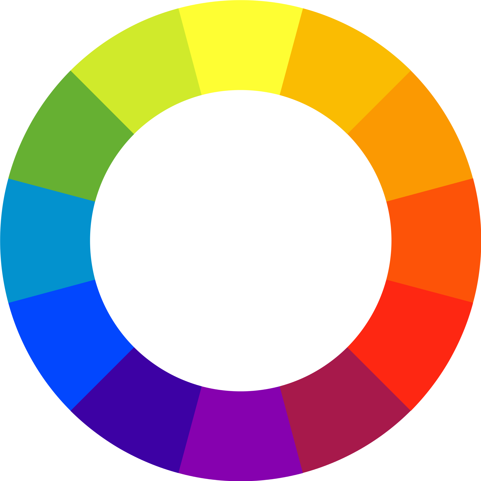 Colour has emotional resonance – this means that when we see a certain colour we have a certain response towards that colour. Be it your favourite colour or a colour you don’t like; it will provoke a response and feeling from you. Many studies have been done and certain colours tend to evoke similar feelings from people. Blue can be confidence, calmness, or sadness. Yellow is happy, excitement, or light. Red is happiness, caution, or anger.
Colours connect to an emotional in a memorable visual sense. This makes them a powerful marketing tactic to keep in mind in your next project. The colours in the design can share a message, evoke a feeling or reaction, and create a memorable experience. Some colours are so memorable that the colour has become the trademark for the brand. Think: Tiffany turquoise or Cadbury purple.
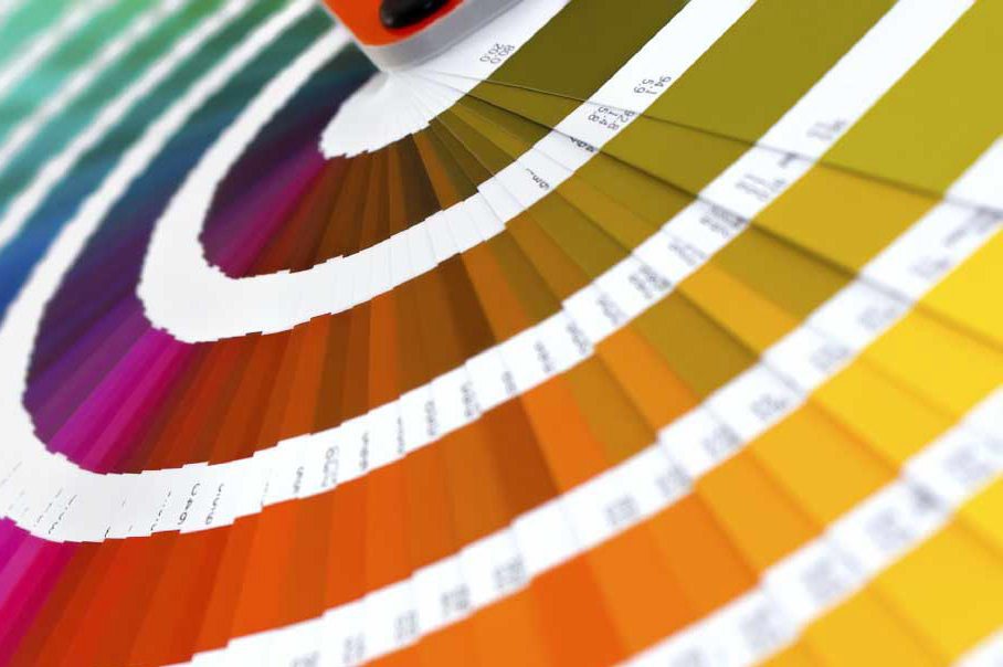
In addition to colour, it is important to look at where and how this colour is being placed. Is it the colour of the font, accent in the margin, brand colour, tone of the website? All these things are different ways that colour comes into play. It’s important to keep in mind that when printing or viewing whatever design you are making, sometimes colour is the first thing that people perceive at the first glance. The details are lost but the colours and harmony of the design is not.
Colour is helpful as it draws attention, sets the tone, and creates a presence for design. It’s a skill to see colour harmony and one definitely worth learning. Don’t fall back on your personal colour preferences but ask yourself why you are choosing each colour; what is its purpose? It also helps to try a variety of colour iterations to find the one that evokes what you are going after.
As we live in a largely visual society, colour is a crucial element in design and there is a visual importance in each colour chosen. Colour impacts the responses and emotions in subtle ways but it is definitely an element not to be forgotten.