First thing is first – what is flat design? Even if you’re not involved in the design world in the slightest you’ve probably noticed that a new design aesthetic has all but taken over. From logos and labels to websites and apps, the flat ideals have taken up residency as the universal style for both big brands and small. In recent years, most brands have gotten a makeover both online and off, opting for cleaner, simpler and more easily translatable branding and web design to cater towards user experience. Gone are the flashy, reflective and wholly unnecessary design elements that we came to know and (almost) love in the early 2000’s, making way for the cooler, more modern style that has a better idea of what’s up for the new age.
Favoring a design that prioritizes simplicity for the sake of usability, flat design dabbles in bright colors, open space, crisp edges and 2D illustrations with an overall clean, minimalistic style. The less distractions the better, and the less functionality the more likely it’ll be pegged as a distraction taking away from the user experience. With mobility so ingrained in our everyday lives, accessibility and user experience is more important to web design than ever before. Lending towards flat design’s minimalistic tendencies, sites are cleaning house and ridding themselves of nonsense clutter that will affect their users experience. Simplicity allows focus on content, and as we all know, content is king.
Color
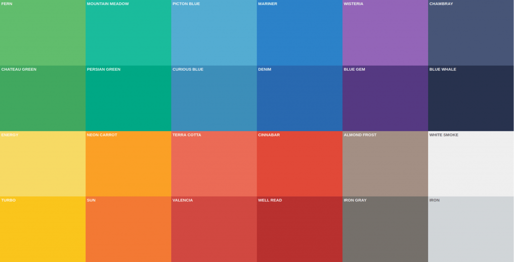
In place of the bevels, bulges, gradients and reflections that lent to design styles of yesteryear, is color. When it comes to flat design, most of the traditional rules about color and matching are thrown out the window in favor of palettes that span the rainbow with lots of pop. Characterized by vibrant, bold, contrasting colors, flat design utilizes color in a way grabs attention, guides the user, and emphasizes elements of the design in both print and digital environments. Bright colors are typically seen as the poster child for flat design, because it creates a distinct feel and has an ability to engage in an otherwise stark environment. In terms of flat design, brighter is better.
Iconography & Infographics
With flat design, iconography has been given a new lease on life. Using simple images to convey ideas in place of text and universally recognized symbols to indicate actions (like envelope=mail), it’s a new means of easy communication to the masses that matches the minimalistic appeal and avoids excessive text. The swell in popularity of infographics, interactive and otherwise, certainly can’t be denied either with many company’s trading in their bland excel spreadsheets for the stylized imagery that flat design offers.

Animation
Perhaps the biggest problem with flat design right now is that it’s universal, which isn’t necessarily bad but it does pose a problem when you’re trying to differentiate yourself. This is where animation comes in. As a means to make websites more engaging and exciting to users, designers are beginning to explore the possibilities behind animating elements of the design to add that extra bit of excitement and engagement. Animation can act as an indicator when buttons don’t look like buttons and all the badges look the same, lessening confusion and being an awesome element at the same time, and if that isn’t a win-win we don’t know what is.
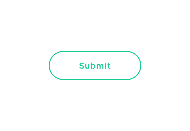
Colin Garven Submit Button
In conclusion, flat design reverts back to the basics of design as a functional tool. The best webpages are determined by how well they function, on all devices; and while there is nothing more frustrating than a complicated website, at the same time there is nothing more appreciated than a nice design.