So you want to get a message across? All you have to do is type out the words, choose a readable font and slap it on the page right?
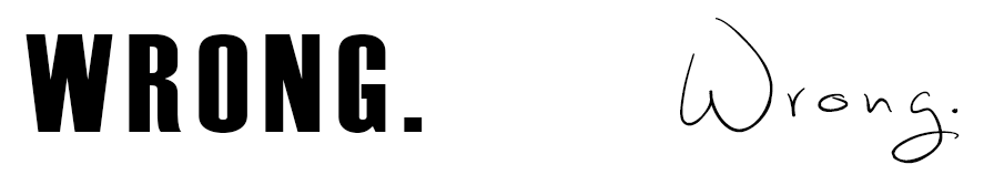
Effective typography is the key to influencing the audience. The font is not only used to carry information but also to trigger emotions, which influence reaction. Emotional design is not a new theory in product design and advertising. Your emotions affect the decisions you make and the actions you take. Think: retail therapy when sad or being inspired when happy. These intentional triggers in emotions can motivate individuals or support a personality when marketing. After all, typography is an artistic representation of words and all forms of art convey an emotional response from the viewer. Good typography should induce a good mood.
So how do I choose from the millions of typefaces out there? Here are some things to think about when choosing a typeface and adjustments for your next document.
Serif or Sans Serif?
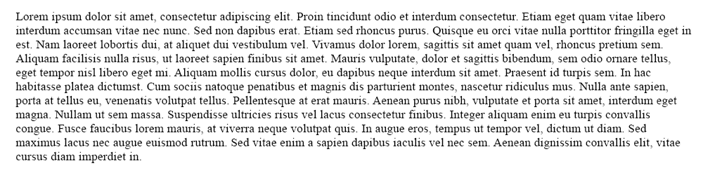
If you don’t know already, serif fonts have lines at the bottom of each letter and sans- serif (without serif) is the font without. Typically larger blocks of texts can get hard to follow and serif is used to keep the eye aligned and not jumping; columns are typically used to help too. Sans serif is used for titles and smaller blocks of texts. 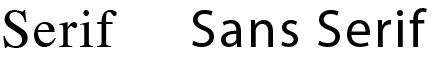
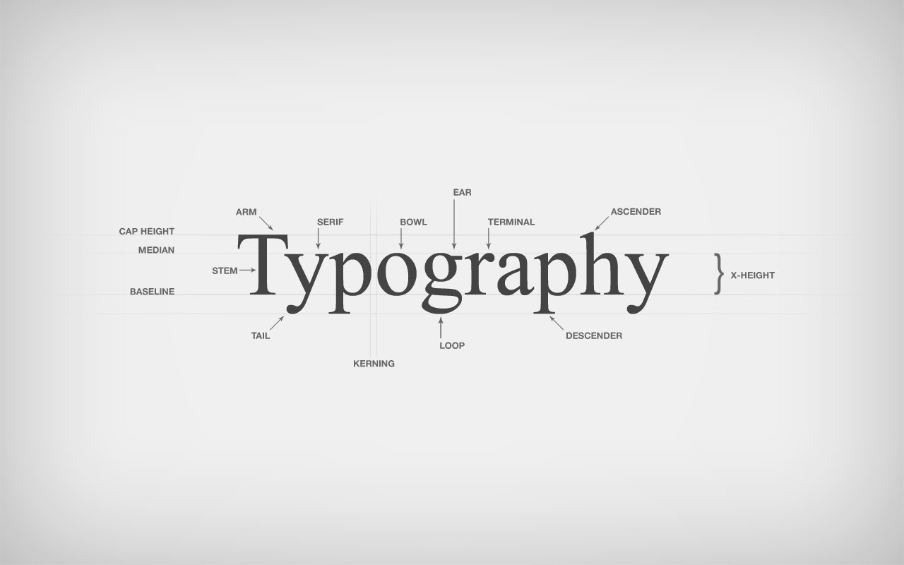
Spacing Spacing Spacing
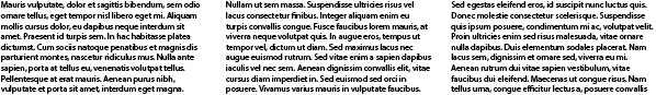
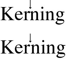
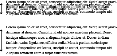
The spaces between letters and words can affect the legibility and overall ease in reading texts. That is why spacing is so important to create a visual flow in reading. The technical terms are kerning, tracking, and leading. Kerning is the spaces between two letters; if the kerning is too tight, the words become illegible and the eye focuses on the area where there is most contrast. Tracking is the spacing between all letters of the word and leading on the other hand is the spacing between the horizontal lines. Tightness and looseness both horizontally and vertically can evoke different feelings. However there is a happy medium to keep the legibility; too loose and it’ll look like a scattering of letters, too tight and you can’t decipher it.
![]()
What is most important?
Hierarchy is extremely important to keep the content organized and to not have multiple focus points that will confuse the reader. Now we take a look at the bigger picture, topics that are most important should have more presence. Things such as size, capitalization, boldness, colour, and contrast of the typography can be used to create a strong presence for the title and a more subtle visual for captions.
And finally all these things should be taken into consideration with the tone and content of the subject you are writing about. Use them to enhance and make a personality just like when writing in different styles; you are visually styling your text.
Feature image courtesy of: better2web.com