Creativity is something unique to every designer, we all have a creative license so we should all be able to design whatever our hearts desire, right? Not quite, when you’re creating something that will be the face of your company, the thing that will represent your brand for years to come, it is best to rein in that creative freedom just a wee bit.
Start Off On The Right Track
Start off by teaming up with a graphic designer who can get on the same page as you and see your vision as clearly as you do, then take a big step back and ask yourself, ‘am I on track to commit a graphic design crime?’ If you do not know the answer to that question keep reading.
Clean Up The Clutter
Minimalism has become popular in all aspects of design, from interior to graphic to architecture. For good reason too, clutter will turn people off faster than you can pronounce the word itself. If you are looking to draw prospective clients in based on your logo, keeping your logo clean and clutterless is your first step in the right direction.
I Need My Space
This detail more than likely sails over most people’s heads until they see it. Kerning, also known as the space between each letter, can make or break your logo. If the spacing is too minimal your future customers may not be able to read the name of your company or worse, miss-read it. On the other hand, if there is too much space it may break the connection you were hoping to make with your audience. Either way proper kerning in graphic design is key.
Oh So Fancy
We all want to be unique, stand out from the crowd and do the thing that no one else has done before. However, that does not mean that using superfluous fonts, or outrageous sizes or colours is going to do the trick. In fact it will more than likely have the opposite effect. So find more ways to stand out that will not instantly put your audience off.
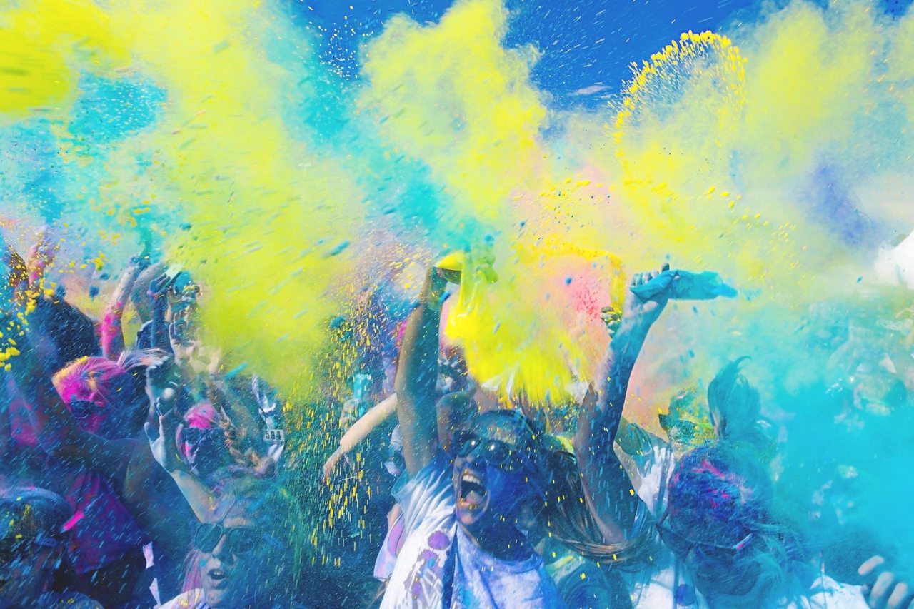
Double Rainbow
Colour is a beautiful thing, but there is a reason you take the time to develop brand guidelines and choose one or two colours to represent your business. If you have more than three shades in your logo, it is probably time to go back to the drawing board. When you keep your palate clean and concise the effect on your prospective clientele will vastly improve.
Pretty, It Is Mine Now
There are a lot of beautiful logos out there, and like any art, when something is great we want to absorb it, then spit it back out and call it our own. Aside from receiving a pretty little cease and desists order from the brand you blatantly ripped off, people will see you as the ‘less hot version’ of that brand. It is okay to take aspects of great logo design, but find your own voice within that.
This is a lot to digest all at once, so take it slow when evaluating your logo design ideas. Have open conversations with a talented graphic designer to whittle away at the garbage and come out with the best logo to represent your unique brand.
Ready to climb this mountain? Give us a call or shoot us an email, we may just know a few amazing graphic designers with experience navigating this terrain to save your tooshie.