Ok. The title is misleading. This blog post is not just for dummies. It’s for the people out there who have had an idea. Call it a spark, a lightning bolt or a lightbulb going off, you have had a brilliant idea for a product/service/business. You have the idea, the plan, the funding and a name – now you just need the logo.
Designing a logo or getting one designed can be such an exciting experience. That excitement can be a double edged sword, especially when that motivation and surge of ideas comes together to create an overly busy and impractical logo.
We have compiled a list to help you stay grounded and remind you of the things you should keep in mind when getting logo work started.
Storytime
– Your logo should “tell the story” of who you are. If you are a fishing lodge a fish is good bet. More than that, it should feel like your company. To that end, logos that display a connection to your businesses vision or mission is recommended, though not always possible, depending on how abstract your mission statement is.
K.I.S.
– Keep It Simple. It is so easy to get excited when it comes to logo design. You can be BURSTING with ideas, it’s great when you are flooded with ideas, but your logo shouldn’t be. Cluttered, busy, crowded, these are all adjectives that you don’t want anyone to use when describing your logo. The more detail your logo has the less versatile it will be. Speaking of versatility…
Show Context
– Your logo will need to be used in many places. Signage, shirts, hats, pens, letterhead, the list goes on. It’s one thing to see your logo against a big white screen, it’s another when you see it on the side of a photograph surrounded by other colours. Have your design mocked up so that you can see what it is going to look like in its natural habitat.
Evergreen
– The journalism industry has a word for ‘timely’ content. They call it evergreen, which refers to a story that will always be relevant. You want your logo to be evergreen. If you use the most current design trends in your logo design it will be really cool for a year or two, but over time it will begin to look dated. You know what a great way to keep your logo evergreen is? The typography that is used.
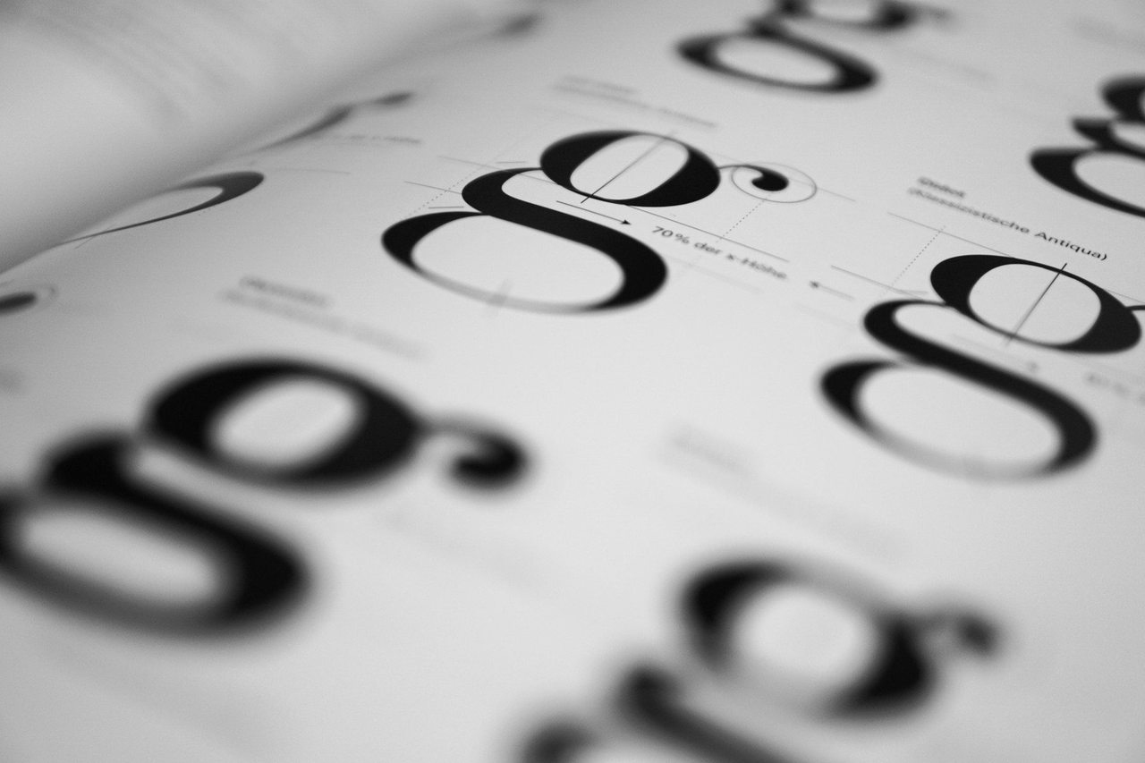
Typography
– Your type face is going to make or break your logo. Avoid kitschy fonts such as comic sans, papyrus, curlz and hobo. The graphic design world actually has a vendetta against them, they all make it on every worst font list – and for good reason. Keep an eye on script fonts, they can be cool but the smaller they get the more illegible they are. One font is ideal, two fonts are good. Don’t use more than two fonts. If you are going with two, avoid typefaces that are too similar to each other. You want a font with a lot of spunk and personality while the other should be more plain to offset the personality.
Don’t Go it Alone
– Design may seem fairly simple, but it is not. A consummate professional will definitely make logo design look easy. Trust us, it isn’t. Have a professional help you with your design. The best designs come when you give a professional designer the background of your business, colours you are drawn to and the design elements you think you want to incorporate. Let them run with it and bring you options. Your friendly neighbourhood professionals, talonX, can always help you with your logo needs.