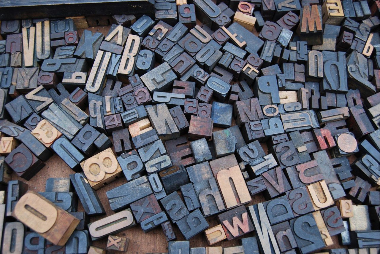
Typography is perhaps one of the greatest tools of a designer; and throughout history and within this industry we’ve seen it grow from its basic use as informative type to an art form in itself. Contributing to this growth, as with most things these days, is of course the use of technology and new digital practices that were previously unavailable to us. Now, a good typeface is appreciated in much the same manner as a fine vintage (or is that just us?) so as we look back and ahead at what makes a good typeface and creativity in its design, hopefully we’ll be that much closer to understanding our obsession with it.
The Beauty/Ugliness of Typography
A good font obviously has to be readable, a better font will have a little bit of personality to play with and the best fonts (like the best Pho) will have a little secret sauce of sorts that people will respond to naturally, making them want to work with it more. In simpler terms, the best fonts are those that unify functionality and beauty.
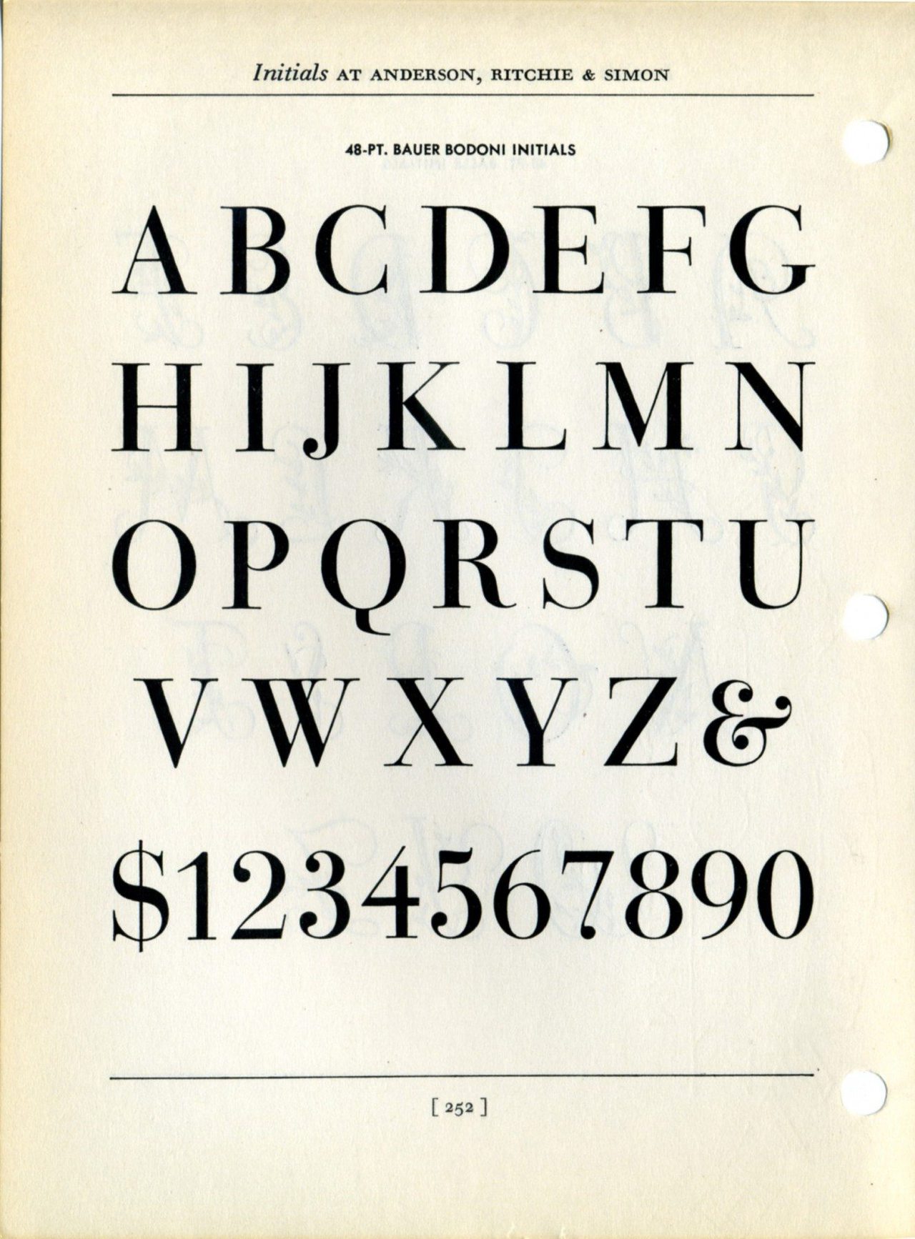
Though anything that involves an ideal of beauty is bound to be personal and subjective. Typefaces designed by Francois-Ambroise Didot and Giamattista Bodoni are considered by some to be the most beautiful of all time, and consequently it was Bodoni himself who laid down the ground work for type design “from which all beauty would proceed” namely: regularity, clarity, good taste and charm.
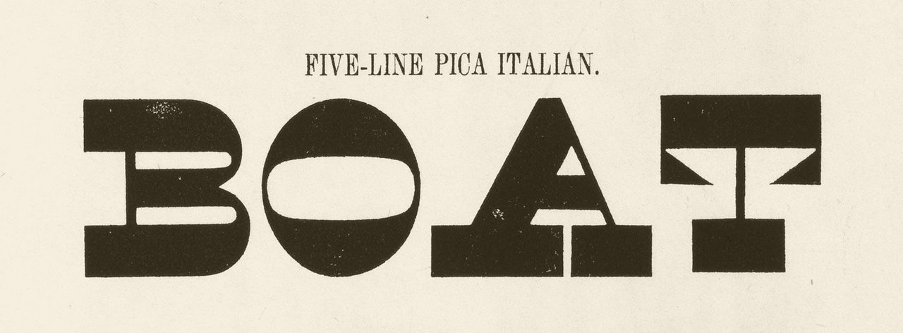
But how meaningful would beauty really be without the ugly? While capturing beauty is normally considered to be the primary goal of artists and designers, there’s something to be said for ugliness that evokes in us a sense of primal curiosity. In creating a deliberately ugly typeface, there may be method to the madness. Caslon Italian defied our expectations of beauty and subsequently gained attention because of it. Albeit being described as perverse, degenerate and monstrous, there’s no denying that in a world of heavily saturated commercial messaging, it certainly stood out.
Typography in Design
Good typefaces are designed for good purpose, but even the best fonts aren’t suited to every situation. While there seems to be an ongoing battle between san-serif and serif and which is better for what, ultimately our preference for font is impacted by our culture. We read best what we’re most used to. When it comes to output though, some things need to be considered.
Some fonts look great in print and awful on screen and vice versa so keeping in mind the context is important. Decorative fonts do best as headlines or logos, script fonts usually fare better in formal invites or the ilk and when it comes to the web the possibilities of type have expanded enormously in recent years, bringing the aesthetics of print online.
Typography as Design
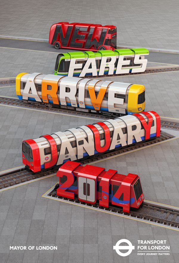
Since the rise of digital typography and technology, the art of type has known an expansion in design, allowing imaginations to flourish. The use of creative typography has resulted in clever new advertisements, branding and marketing strategies across the board, engaging audiences in new ways. With the new flexibility typography has in the design industry, it’s been able to evolve from mere functional typeface to a functional art form.
The Future of Font
Sustainability in design isn’t a new concept by any means, but when 14-year old Suvir Michandani worked out that the US government could save millions in printing costs by switching fonts on official documents from Times New Roman to Garamond, it got creatives thinking: why stop there?
Enter Ryman Eco the most sustainable font ever created, using 33% less ink than a cache of standard fonts and 27% less than the current leading sustainable font. Up close Ryman Eco’s typeface is made up of channels of negative space, but when printed, the ink bleeds into the white space creating the illusion of a fully filled letter.
But for a truly successful typeface, it needs to be accepted by the design community and with that being the case, it had to be more than functional, it had to be beautiful as well. Drawing back to the principles of what makes a good font (legibility, personality and secret sauce) it’s still too soon to say whether or not Ryman Eco will be widely adopted and if so, if it will make a significant environmental impact, though it’s undeniably a small step in the right direction.
You can download the free Ryman Eco font at http://www.rymaneco.co.uk/