It’s an age-old battle: combining typefaces has been the bane of designers’ existence for more years than we care to admit, where success can be complicated and failure lurks around every corner and kern. Adding to the challenge is the fact that there’s usually no right or wrong answer; but when you do succeed, not only do you win bragging rights for beating a design equivalent Boss Level, your font pairing will be the gift that keeps giving and undoubtedly will help bring your design together as a whole whether you’re creating a kick ass website design, a stand out logo or just some cool graphic design items for fun.
Like with most undertakings, you first have to understand the rules. While design has a tendency to bend, break or completely ignore rules, when it comes to mixing fonts there are a few important factors to keep in mind.
The Limit Actually Does Exist
The more fonts you use, the more they compete and the messier it’s likely to get. The general rule of thumb is to keep it within 2 or 3 variants with each serving a specific purpose (i.e. headers vs. titles vs. body text). Each typeface has to earn its keep and if it doesn’t have a motive it’s better to kick it to the curb. Less is more in this case and most projects will benefit from a little more thought and restraint.
Contrast without Conflict
Finding typefaces that compliment each other usually comes down to how well they contrast. A lot of fonts bring a distinct flavor to the table, some more practical than others depending on its usage. When it comes to relationships in typography, like people, opposites tend to attract. Typefaces that pack a lot of personality do well with those that are more conservative and easier to read in various sizes and amounts. But style isn’t the only factor to dictate contrast; it can be achieved in numerous other ways such as size, weight, spacing and color which not only helps assign certain roles to each font, it also contributes to hierarchy in the design.
Where it gets complicated is making sure that the fonts aren’t too different. Due to the sheer number of typefaces available, generally there are more than a few that share similar qualities in terms of proportion or height (aka x-height). While san serifs and serifs traditionally work very well together, if their shape and x-height differ too much it could cause more discord than harmony. However, too much similarity can also be problematic, which leads us into our next point.
Family Matters (but familiarity breeds contempt)
Another term worth knowing is concord, which refers to different typefaces that share the same overarching font family, a ‘superfamily’ if you will. A superfamily is comprised of typefaces in different weights, styles and classifications specifically designed to work together. Some superfamilies will even include a serif and sans serif version of the same typeface.
But where similarity becomes an issue is when the typefaces are too much alike. In this case it can become difficult to establish a hierarchy, as the fonts are too similar to distinguish one from the other. Even those that appear different may share too much of the same characteristics in weight, proportion and shape to be distinctive of each other. A good way to test this is by placing your two fonts side by side and blurring your eyes slightly. If the fonts end up looking basically the same it may be time to reconsider your combination choices and amping up the contrast in one or the other.
Consider Context
Thinking about how the type is going to be displayed can also help in choosing an appropriate font. When choosing a typeface for body copy your priority should be readability and while there’s an ongoing debate on whether san serif or serif is better for this, generally it’s believed that serif fonts work best for large amounts of text in print whereas san serif fares better online. Another important consideration in printed material is the size it will be displayed at. To maximize legibility in super small print, typefaces that incorporate wider spacing between letters and all caps can increase its legibility. Lastly, when dealing with font personalities, context is key. The same font you use for a law office may not work for a children’s boutique or a retro style café.
More often than not, when combining typefaces, you’ll find yourself relying on your gut feeling more than anything else. The best suggestion for combating the challenge of font pairing is simply practice; experimenting and taking risks can sometimes end in surprising and satisfying results. And now that you know the “rules” you’re now free to bend, break or ignore them completely.
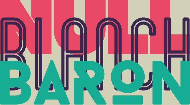
Image courtesy of Silo Creativo